
The Challenge
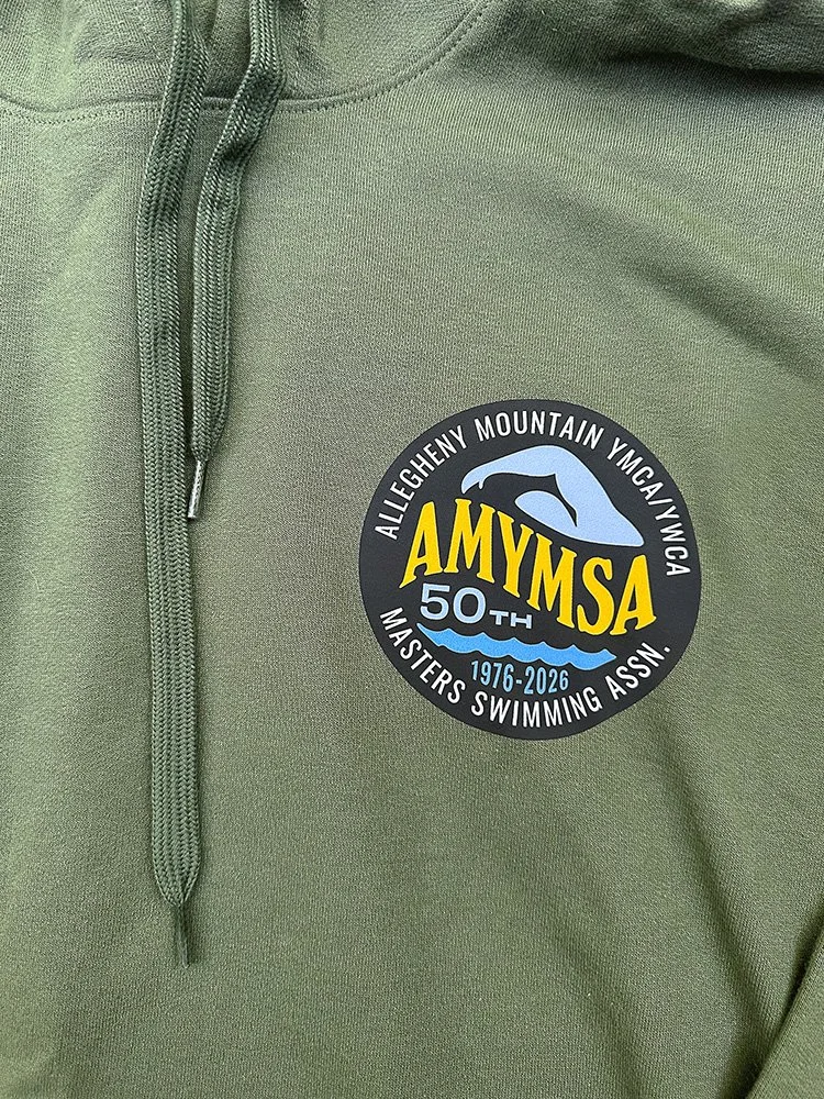
The Allegheny Mountain YMCA Masters Swimming Association needed an anniversary logo to celebrate its 50th season. The goal was to create a fresh, updated mark that honored the organization's history while drawing inspiration from logos used throughout the years.
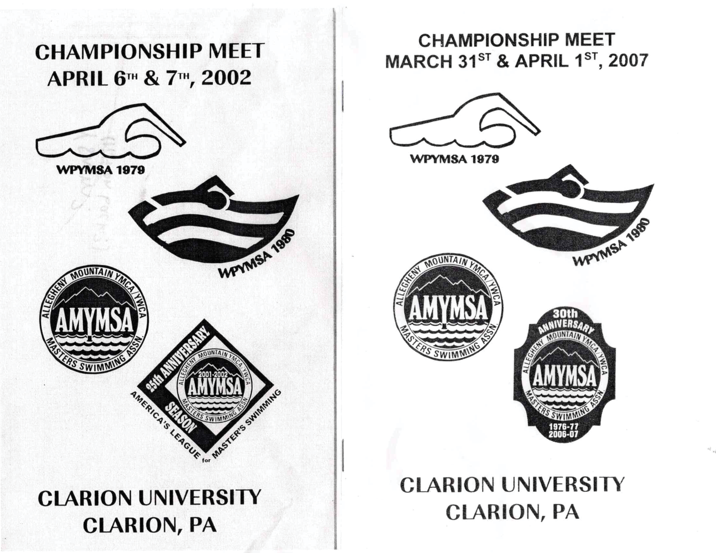
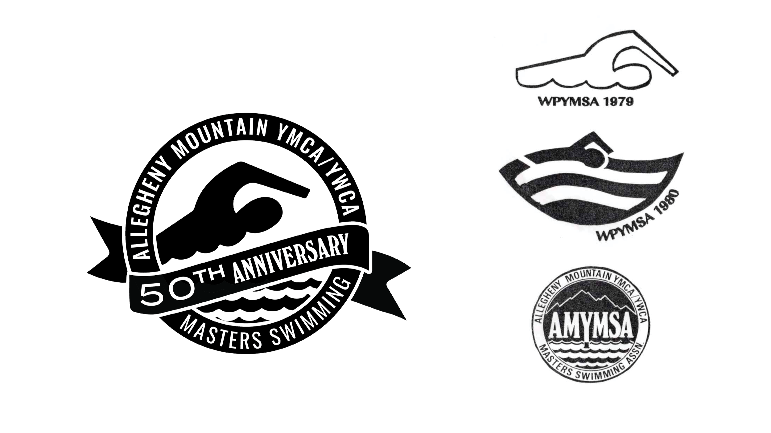
Past Reference Logos
Option 1
Option 1 draws inspiration from several past AMYMSA logos. It retains the circle and water elements from the current design (minus “Assn.” for space), adds a banner to mark the anniversary year that echoes the curve from the 1980 logo, and reintroduces the swimmer figure from the 1979 version. It does not include the wordmark.
Option 2
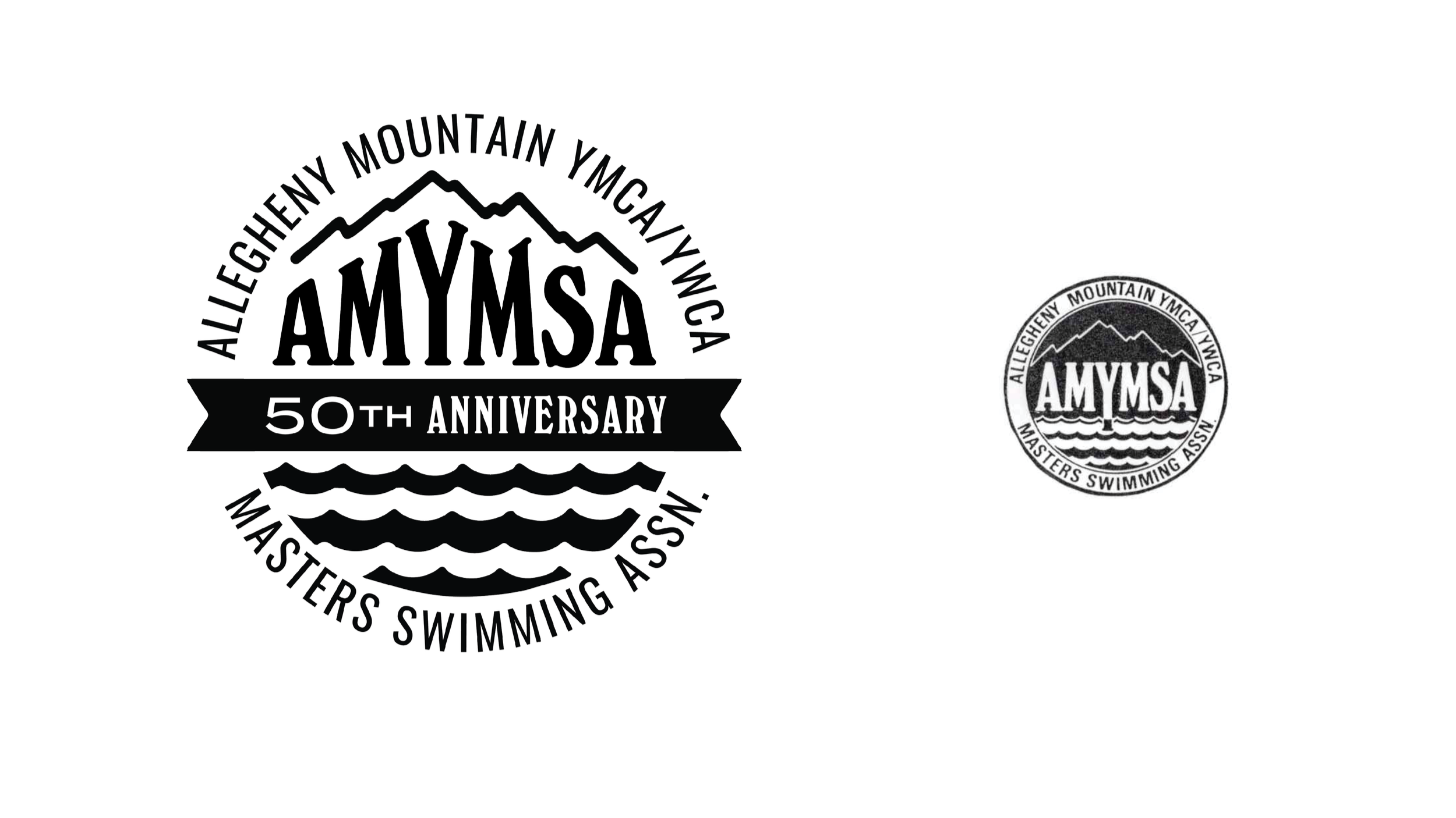
Option 2 is entirely inspired by the current logo. It maintains the circular shape but opens it up, with a 50th anniversary banner cutting across the center. Waves sit below the banner, while the AMYMSA wordmark and an enhanced mountain line sit above. The mountain has been thickened for a more cohesive feel, and the wordmark has been adjusted to echo the shape of the mountain.
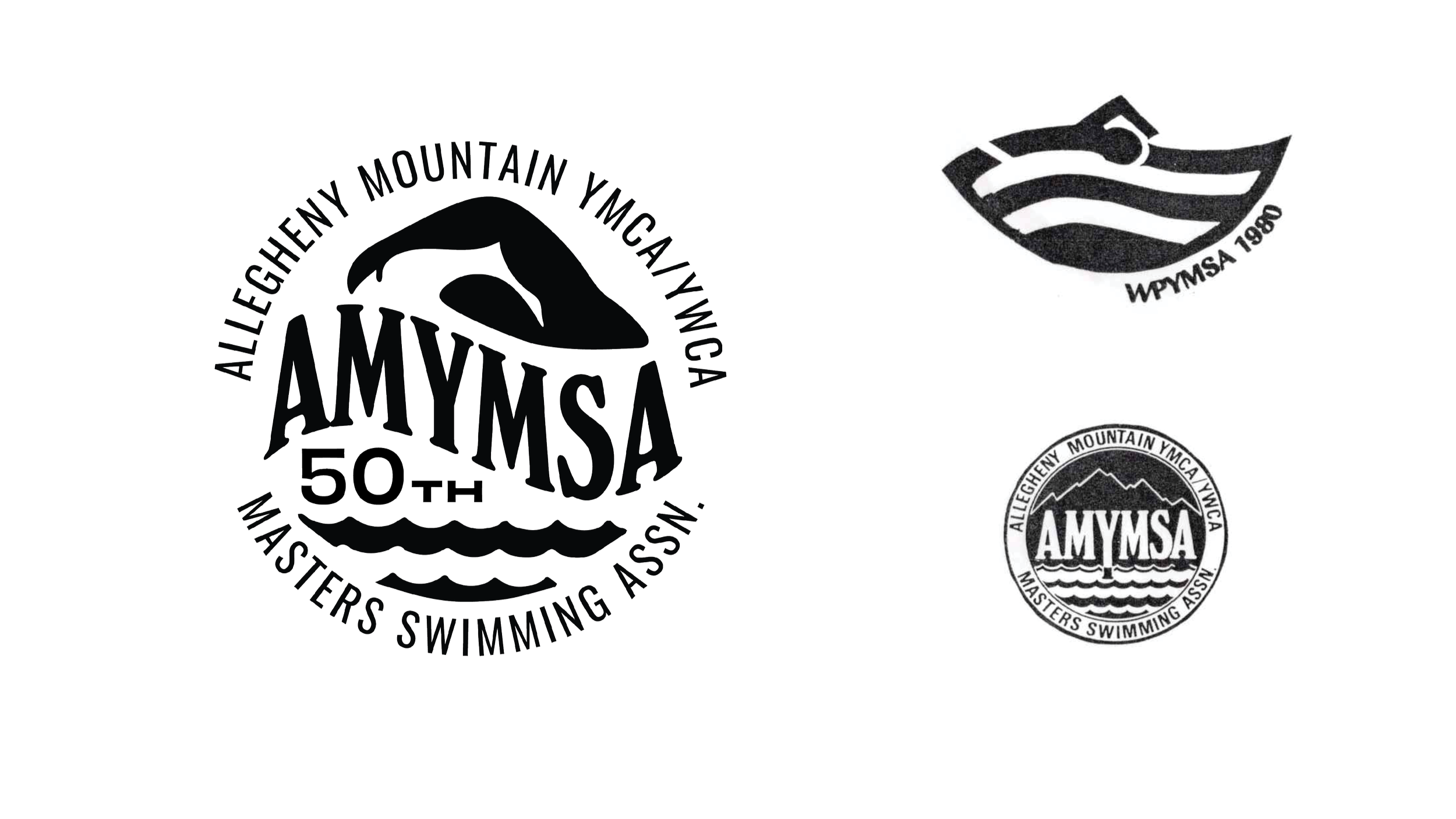
Option 3
Option 3 is a reimagining of both the current and 1980 logos. The swimmer is transformed into a mountain-like shape, creating a strong balance between image and negative space. The waves from the current logo remain at the bottom, and the wordmark follows a flowing, wave-like curve inspired by the 1980 design.
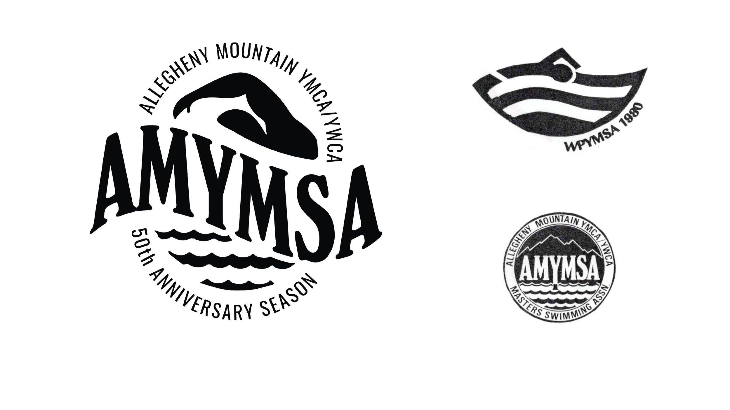
Option 4
Option 4 closely mirrors 3, with a few key differences. It features the reimagined swimmer as a mountain shape, along with the current waves and a wave-like wordmark inspired by the 1980 logo. In this version, the circular frame is removed to give the wordmark more visual weight. “50th Anniversary Season” replaces the usual “Masters Swimming Assn” text, but this can easily be swapped back for future seasons, making this a flexible option for long-term use.